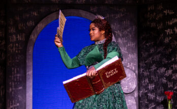
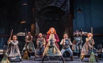
Story and photos courtesy of Wicked North American Tour.
The Tony Award winner for Best Costume Design discusses her process for creating costumes for Wicked.
How did you approach the task of designing Wicked’s costumes?
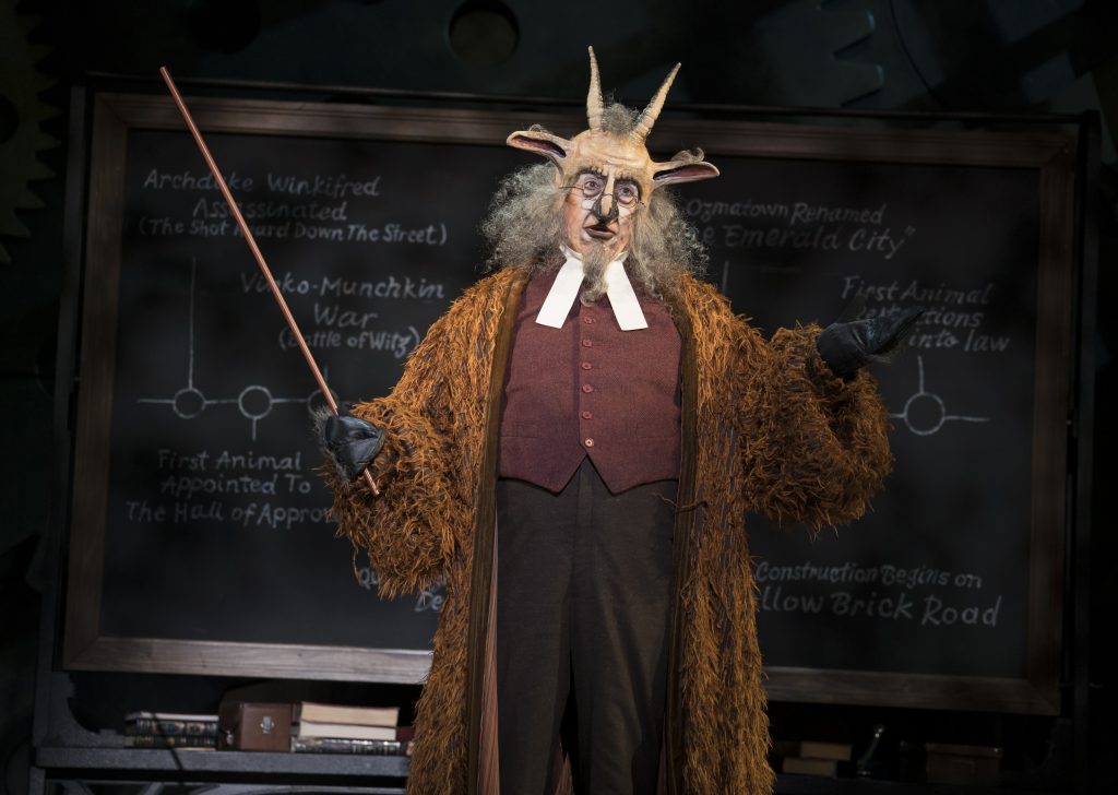
Susan Hilferty: I knew I was inventing a world, a parallel universe you’d recognize but at the same time was completely distorted. I looked at the original illustrations for the ‘Wizard of Oz’ books – which is where the Edwardian influence comes from – but with a contemporary eye. The silhouette is twisted, asymmetrical. The idea was to distort the human figure, but in a high-fashion kind of way. The way the animals looked is also invented: the monkey-skins, faces, tails, the goats. The 1939 movie didn’t help: that was a ’20s world, and nothing made sense to this story.

How would you
describe the overall look of the costumes?
SH: “Twisted Edwardian.” I found what I was doing was almost designing each
idea twice; I had an idea that was straight, and then I had to transform it. In
some cases I was acting like a fashion designer, much like Vivienne Westwood or
Alexander McQueen, who will look at another time period and then exaggerate it
and make it their own.
What aspects of the show did you keep in mind while bringing your costumes to life?
SH: My goal was to create a third world, a world that we considered to be a parallel universe. It’s a world where animals can talk, so we know it’s not our world. It’s a world that deals with a kind of inventiveness, things that we might call magic. The boundaries of the world are different than anything we know or are familiar with, but at the same time, the issues for the people of this world of Oz are in many cases the same kind of issues we deal with. So I knew it had to be something that was of the imagination but in some ways had to thread back to things that we knew.
Is there any significance to the white and blue school colors of Shiz University?
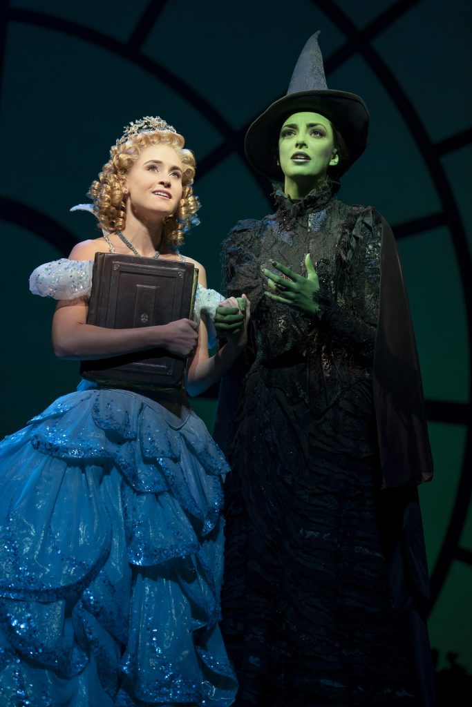
SH: What I was trying to get at the end was an icon for each of the witches, where they become specifically representative: Glinda for goodness and Elphaba for evil. By using blue and white as the school colors, I was able to have Elphaba all in blue, and Glinda all in white. The goal was to make the two women be the most outstanding thing in every world they entered.
Is it true that you reserve your highest praise for lighting designer Ken Posner?
SH: I gave him the biggest challenge you can give a lighting designer: two leading ladies, onstage together for most of the show, and standing next to each other for most of the show; one dark girl with black hair, green skin, dark clothes, and a hat with a brim on it, standing next to a blonde in white shiny clothes, white skin, no hat. That’s hard. That’s the classic. Kenny was brilliant about it and made it balanced so you never knew it was an issue.
